
Lompat ke konten utama

Brand kit

The Hidangi look, in one place.

Warm, friendly, and unmistakably ours — a playful bento system built for small restaurants. Here are the logo, the exact colours, the type, and the voice, taken straight from the shipped product. Please use the real assets below.
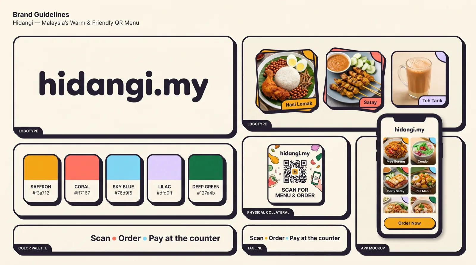
Hidangi brand board — logo, food photography, QR menu and colour system on a warm cream grid
01

The mark is Bento H — a bold H built from rounded saffron and coral blocks, next to the hidangi.my wordmark. It reads as a friendly menu grid: hospitality, blocks of food, a table laid out.

Wordmark
WordmarkPrimary lockupSVGPNG
Bento H mark
Bento H markIcon-only, squareSVGPNG
App icon
App iconThe shipped icon — cream groundPNG
Mono mark
Mono markOne colour — inherits the text colourSVGPNG
The mark inside its clear-space boundary
Clear space — leave a margin of at least 25% of the mark’s height on all four sides. Nothing enters it: no text, no rule, no other logo.
The mark at its smallest permitted size on screen24px
Minimum size — 24px tall on screen, 8mm in print for the mark; 120px / 30mm wide for the full wordmark. Below that, use the mark alone.

Do

  • Use the SVG wherever the medium allows — print, signage, and large screens.
  • Use it on the cream ground, white, or a calm light photo.
  • Use the supplied assets at their native proportions.

Don’t

  • Stretch, rotate, recolour, or add shadows and gradients.
  • Place it on a busy or low-contrast background.
  • Redraw it or swap in a different mark.
02

Colour

A warm neutral ground with saffron as the accent — a fill for brand actions, never small text. Every value below is the exact token the apps and web share, checked for WCAG AA where it carries meaning.

Core

#211E2B
InkText and borders — the warm near-black15.4:1 on ground
#FBF8F1
GroundThe neutral warm canvas every screen sits on
#FFF8DE
CreamA warmer tint for large accents
#F1ECE0
PaperSunken surface behind cards
#FFFFFF
WhiteBento card fill

Brand & accents

#F3A712
SaffronThe brand action — a fill, never small textink on it 8.05:1
#FF7167
CoralPlayful accent (landing, highlights)ink on it 6.08:1
#76D9F5
SkyAccent + focus ringink on it 10.1:1
#DFD0FF
LilacSoft accent (AI, secondary highlights)ink on it 11.4:1

Semantic

#127A4B
SuccessAvailable, accepted5.06:1 on ground
#C4362C
DangerSold out, destructive, needs attention5.06:1 on ground
#2960C4
InfoLinks and informational text5.55:1 on ground
#5F5A6B
SecondaryMuted text on light surfaces6.26:1 on ground
03

Type & voice

Sans · Inter

Aa Bb Cc

Interface and body. Prices, menus, buttons.

Serif · Georgia

Aa Bb Cc

Editorial headings on the web and blog.

Mono

09:41 · #A12

Labels, order numbers, codes, hex.

Roles

  • Nasi LemakDisplaySerif, bold · iOS system serifThe one editorial headline on a marketing page
  • Nasi LemakTitleRounded, semibold · iOS system roundedScreen and card titles
  • Nasi LemakBodySans, regularEverything a person reads — menus, copy, labels
  • Nasi LemakMonoMonospaced, tabular figuresMoney, order numbers, table codes, hex

No fixed point sizes. Every role is a Dynamic Type text style on iOS and a relative size on the web, so text follows the reader’s own setting — an order fact is never pinned to a size it cannot grow out of. Two weights carry the hierarchy: regular and semibold. Body copy stays between 45 and 75 characters a line.

Voice

We sound like
  • Warm and plain — a helpful neighbour, not a corporation.
  • Short and practical. Say what to do, then why.
  • Respectful of a busy one- or two-person restaurant.
We avoid
  • Jargon, hype, and fake urgency.
  • Implying we take payment — guests always pay at the counter.
  • Over-promising “guaranteed” alerts or results.

English is the default interface language; AI content and the blog also speak Bahasa Malaysia and Bahasa Indonesia.

04

The bento system

Content sits in white bento cards with thick ink borders and a soft offset shadow, on the warm ground. Saffron fills the one primary action. It should feel tidy, tactile, and a little playful — like a well-laid tray.

TodayRM 42818 orders
MenuNasi Lemak · RM 8.50● Available

Do

  • One saffron primary action per view; the rest is calm.
  • Thick ink border (1.5–2px), rounded corners, small offset shadow.
  • Name colour by role — pair it with text or an icon, never colour alone.

Don’t

  • Flood a screen with saffron — it fatigues the eye.
  • Use thin, borderless, floaty cards.
  • Rely on hue alone to signal sold-out or danger.
05

Spacing

One 4pt ladder, shared by the web and both apps. Every gap comes from it — never a new number. What matters is not the value but the ratio: things that belong together sit tight, things that do not sit far apart. A uniform gap everywhere is not rhythm, it is the absence of one.

  • xs4pxInside a label — icon to its text
  • sm8pxBetween things that are one object
  • smPlus12pxA heading to the rows beneath it
  • md16pxCard padding; between related rows
  • lg24pxScreen gutters; card to card
  • lgPlus32pxBetween two distinct groups
  • xl40pxSection to section
  • xlPlus48pxA major break on a long page
  • xxl64pxPage top and bottom
06

Shape & elevation

Corners are generous but not soft. Depth is a hard offset — the same ink as the border, moved 2–4px down and right, with no blur and no opacity. It is a printed look, not a floating one, and it is the single detail that makes the bento system feel tactile.

sm · 8pxChips, small tiles, inputs
md · 14pxBento cards — the default
lg · 22pxSheets, hero panels
pill · 999pxStatus pills, tags, Skip

Border 1.5–2px ink on every card. Offset 2px for small chips, 3px for cards, 4px for a primary button. No soft drop shadows anywhere.

07

Icons

Do

  • Use SF Symbols in the iOS app and the platform equivalent on Android — they inherit weight and size from the text beside them.
  • Inline SVG on the web, stroked to match the ink border weight.
  • Always pair an icon with its label. Status is never icon-only and never colour alone.

Don’t

  • Mix a web icon set into a native screen — it is the clearest tell of a ported interface.
  • Use filled and outlined variants of the same icon in one view.
  • Draw a new icon when a system symbol already means it.
08

Motion

Motion confirms an action; it never decorates one. A press dips the card 100ms ease-out. Screens use the platform’s own transitions — pushes slide, sheets rise, dismissal reverses the entrance. Nothing bounces and nothing springs.

Every animation honours prefers-reduced-motion and the system Reduce Motion setting, replacing movement with an instant change or a crossfade. Content is never hidden until an animation runs.

09

Photography

Real food from real restaurants, shot on a phone. The AI photo tool re-lights a picture; it never replaces the dish — the same plate, the same portion, the same restaurant, on a clean background. That honesty is the product promise, so a before-and-after must always be one photograph, not two.

Do

  • Show the food a guest would actually be served.
  • Keep warm, natural light and a plain, uncluttered surface.
  • Crop to the plate. The dish is the subject.

Don’t

  • Use stock photography of food the restaurant does not serve.
  • Add or remove items between a before and an after.
  • Push colour so far the dish stops looking edible.
10

Writing the name

HidangiThe company and the product. Capital H, everything else lower case — in body text, headlines and speech alike.
hidangi.myThe website and the wordmark. All lower case, and only when you mean the address.
Hidangi QRThe name of the iPhone and iPad app in the App Store. Use it only for the app itself.

Do

  • Write it as ordinary text in a sentence. It never needs the logo treatment to be the name.
  • Use Hidangi™ on the first mention in a formal or legal document.
  • Say what it is on first mention: “Hidangi, the QR ordering app”.

Don’t

  • HIDANGI, hidangi, HidangiMY, Hidang-i, or Hidangi.MY — none of these are the name.
  • Use the name as a verb, or make it plural or possessive in a logo.
  • Put another company’s mark inside the Hidangi lockup, or imply a partnership we have not agreed.

Questions or a partnership? Get in touch.

Brand kit — Hidangi · Hidangi