
Brand kit
The Hidangi look, in one place.
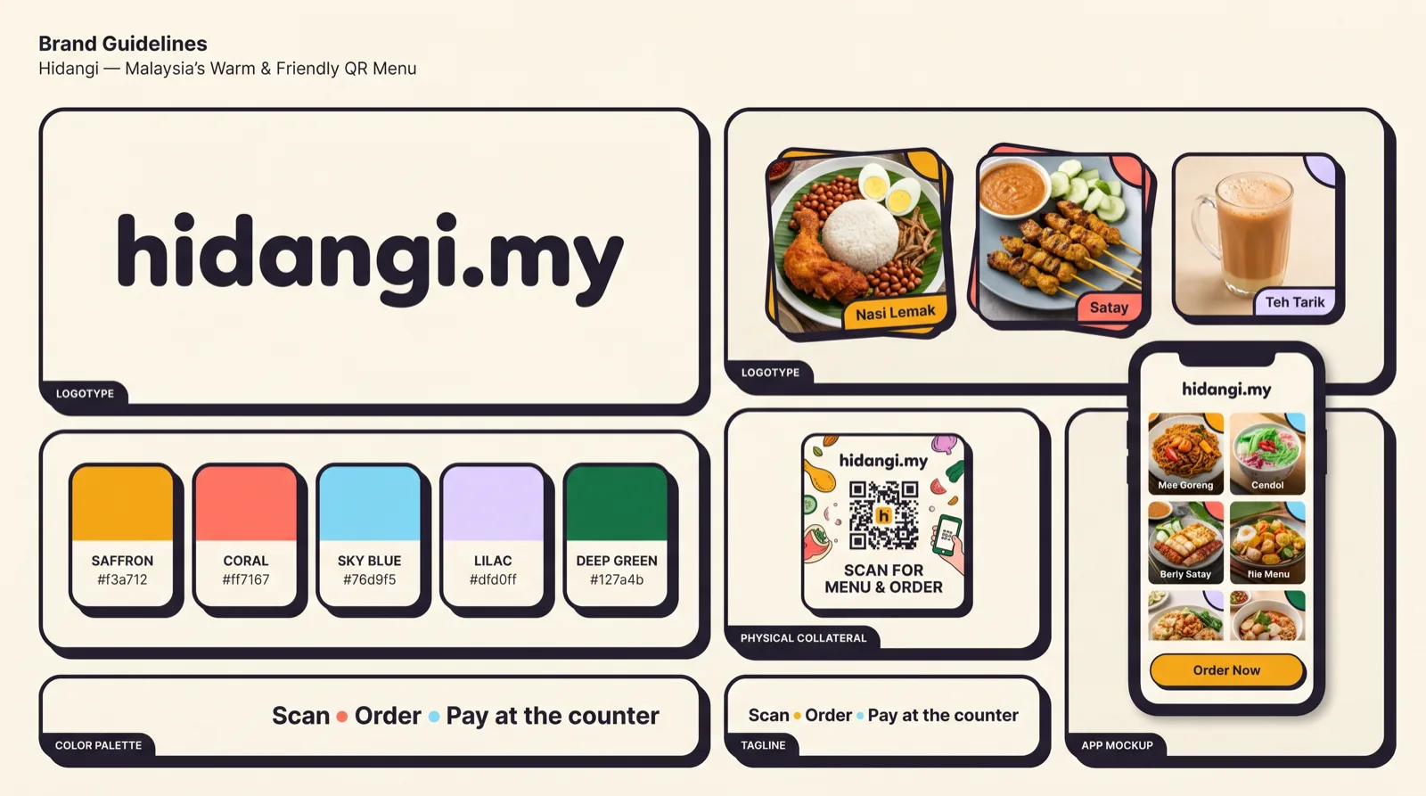
Warm, friendly, and unmistakably ours — a playful bento system built for small restaurants. Here are the logo, the exact colours, the type, and the voice, taken straight from the shipped product. Please use the real assets below.
Logo
The mark is Bento H — a bold H built from rounded saffron and coral blocks, next to the hidangi.my wordmark. It reads as a friendly menu grid: hospitality, blocks of food, a table laid out.



Do
- Keep clear space around the mark — at least the height of the H.
- Use it on the cream ground, white, or a calm light photo.
- Use the supplied assets at their native proportions.
Don’t
- Stretch, rotate, recolour, or add shadows and gradients.
- Place it on a busy or low-contrast background.
- Redraw it or swap in a different mark.
Colour
A warm neutral ground with saffron as the accent — a fill for brand actions, never small text. Every value below is the exact token the apps and web share, checked for WCAG AA where it carries meaning.
Core
Brand & accents
Semantic
Type & voice
Aa Bb Cc
Interface and body. Prices, menus, buttons.
Aa Bb Cc
Editorial headings on the web and blog.
09:41 · #A12
Labels, order numbers, codes, hex.
Voice
- Warm and plain — a helpful neighbour, not a corporation.
- Short and practical. Say what to do, then why.
- Respectful of a busy one- or two-person restaurant.
- Jargon, hype, and fake urgency.
- Implying we take payment — guests always pay at the counter.
- Over-promising “guaranteed” alerts or results.
English is the default interface language; AI content and the blog also speak Bahasa Malaysia and Bahasa Indonesia.
The bento system
Content sits in white bento cards with thick ink borders and a soft offset shadow, on the warm ground. Saffron fills the one primary action. It should feel tidy, tactile, and a little playful — like a well-laid tray.
Do
- One saffron primary action per view; the rest is calm.
- Thick ink border (1.5–2px), rounded corners, small offset shadow.
- Name colour by role — pair it with text or an icon, never colour alone.
Don’t
- Flood a screen with saffron — it fatigues the eye.
- Use thin, borderless, floaty cards.
- Rely on hue alone to signal sold-out or danger.
Questions or a partnership? Get in touch.